Fattoria Cigliano di Sopra
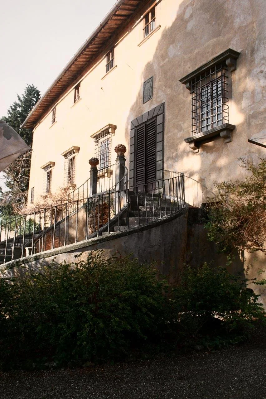

A historic Chianti Classico estate rooted in Sangiovese tradition that sought to refine its brand identity and create a label system reflecting its artisanal heritage and distinct vintages. Project focus: modernise its bottle labels & logo while preserving its authentic legacy.
-
My approach combined an audit of existing labels, research into Chianti Classico traditions, and analysis of competitor wine brands to identify opportunities for differentiation. Through this, I defined the winery’s core brand pillars and translated them into design principles guiding the label system. Close collaboration with stakeholders and the designer ensured the visual identity reflected the estate’s values, resulting in a cohesive and flexible identity that bridges heritage with contemporary appeal.
-
For Chianti Classico consumers, heritage, authenticity, and craftsmanship matter, with labels that show lineage, terroir, and artisanal quality. They expect a premium, timeless aesthetic that communicates both refinement and trust. Storytelling also plays a key role, as buyers respond to narratives that highlight the estate’s history, vineyard practices, and the uniqueness of each vintage. Consistency across all touch-points is essential to maintain credibility and brand recognition.
-
Timelessness: balancing classic elegance with modern relevance.
Artisanal Craftsmanship: celebrating hands-on winemaking and Tuscan heritage.
Trust: reflecting authenticity, quality, and legacy.
-
Captures Cigliano di Sopra’s heritage through a refined, contemporary lens, guided by the pillars of timelessness, artisanal craftsmanship, and trust. The strategy balances classic Tuscan elegance with modern simplicity, resulting in an identity that feels enduring and authentic, a true reflection of the estate’s craftsmanship and legacy.
Visual identity
The concept captures Cigliano di Sopra’s heritage through a refined, contemporary lens, blending timeless Tuscan elegance with artisanal craftsmanship to create an identity that feels both enduring and authentic.
Old Logo - Geometrical & modern

New Logo - artisinal & timeless
Logo typography: Bangla MN

The primary logo is inspired by traditional Tuscan elegance. It is refined, less geometric, reflecting artisanal roots, to evoke timelessness and trust. It may be used for wine labels, official documents, website and product packaging.
The secondary emblem integrates heritage & storytelling. It highlights estate legacy and identity, and may be used for back label storytelling, estate signage, brand merchandise (totes, corkscrews, etc.), brochures and wine club materials.

The color palette embodies Cigliano di Sopra’s timeless elegance and artisanal roots. The deep Chianti red symbolises heritage and the richness of the estate’s winemaking tradition, while gold accents evoke craftsmanship and refinement. The blush pink and soft lilac, used in Ciglianello’s summer label, introduce warmth, approachability, and freshness, a contemporary touch that complements the estate’s legacy with modern charm.

The label design inspiration reflects the brand pillars of timelessness, craftsmanship, and authenticity, balancing classic Tuscan elegance with modern simplicity. Warm earth tones, gold detailing, and organic forms create a premium yet approachable aesthetic.

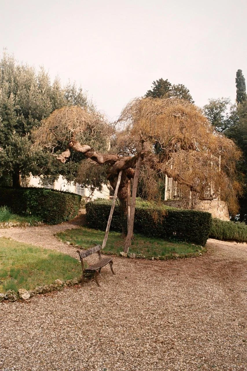
Label design - The new Chianti Classico label draws inspiration from the centuries-old tree that stands at the heart of the Cigliano di Sopra estate, a living symbol of endurance and heritage. Its branches and roots evoke the winery’s pillars of timelessness, artisanal craftsmanship, and trust, while the illustrated weather elements surrounding it (sun, rain, and moon) reflect the real climatic conditions that shaped each vintage. This blend of narrative and symbolism transforms each bottle into a visual record of the year’s harvest, honoring both nature’s influence and the estate’s enduring connection to the land.

Old labeling

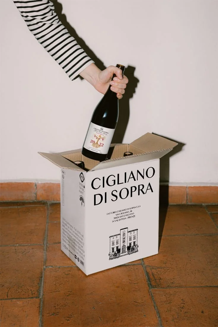
The label system was designed to differentiate the estate’s three vintages; Vigneto Branca, Chianti Classico, and Ciglianello, while maintaining a unified visual language rooted in the brand pillars of timelessness, craftsmanship, and trust.
Each label reflects the wine’s character: Chianti Classico embodies tradition and balance, Vigneto Branca highlights single-vineyard excellence, and Ciglianello embodies a fresh-playful spirit, an easy-drinking wine perfect for summer. Together, they form a cohesive family that elevates recognition while honoring the estate’s artisanal heritage.
Unsold Bottles Relabelling: For Collectors & Timeline Storytelling Concept
This concept gives remaining vintages a second life by turning them into collectible, narrative-driven pieces. Each label highlights the year’s weather conditions that shaped the grapes, while a blue ribbon (a nod to Tuscan tradition) reinforces local heritage and authenticity.
This approach transforms unsold bottles into visually distinctive storytelling objects that engage collectors and wine enthusiasts while strengthening the estate’s brand identity.

2016 - L’Inizio (Radici/Root)
The Beginning - In 2016, Cigliano di Sopra laid its foundation in sandy-clay soils and structured terrain. This vintage expresses the natural purity of Sangiovese and the estate’s essence.
Symbol: Earth tones, vineyard roots, soft structure. Elegant, grounded, and honest.
2017 - Il Secondo Capitolo

Second Chapter - The 2017 vintage is a year marked by heat and drought. Hand-harvested on an early September 14, only 1413 bottles were crafted—Fermented with native yeasts in open steel vats and aged on fine lees in 500L French tonneaux.
Symbol: Harsh Tuscan sun high above the vineyard roots. Expressive, Charming, and Mineral-rich
Applications

Used across labels, packaging, signage, and brand collateral to ensure consistency and recognisability.